01The problem
A learner finishing a Novatr course had already bought placement support. It was part of the course promise. What they actually encountered was a Slack channel, an email thread, and a Google Form sent 30 days before graduation.
They could express interest. After that, the process disappeared. A learner had no way to see:
- Whether an opportunity matched them
- Whether their profile had been reviewed or shared
- Where an application stood
- Why they were ineligible
- What they could do next
Every one of those is answerable. None of them was being answered. The work of the placement team was real and continuous, and almost none of it was legible to the person it was being done for.
“Messages get skipped in Slack.”
That line appears more often than any other in the discovery notes. It is a small complaint describing a large problem: the only channel connecting a learner to their own placement process was one they could scroll past.
02Evidence
Satisfaction held through the learning experience, then dropped at the moment the company’s placement promise came due.
Novatr measured customer satisfaction at every stage of the learner journey. The data made the placement stage an unambiguous priority, while later reflection showed us where quantitative evidence alone was insufficient.
| Stage | CSAT |
|---|---|
| Acquisition | 0 |
| Activation | 0.0 |
| Engagement | 0 |
| Completion | 0.0 |
| Placements | 0.0 |
Net Promoter Score told the same story by segment, and it fell the further a learner travelled.
| Segment | NPS |
|---|---|
| Learners, 0–3 months | 0 |
| Learners, 4–7 months | 0 |
| Graduates, placed | 0 |
| Graduates, not placed | −0 |
The operational picture
| Measure | Baseline | Target |
|---|---|---|
| Opening live → profile shared with a company | 60+ hrs | 16 working hrs |
| Application rate on relevant openings | 0% | 0% |
| Back-outs during hiring | 0.0% | <10% |
| Shortlisting rate for shared profiles | 0% | 0% |
| Eligible learners among those interested | 0% | 0% |
| Relevant openings per learner, per week | 0 | 0 |
The last row is the clearest example. Relevant openings per learner per week is a supply-side measure. It moves when the partnerships and placement teams bring in more of the right roles. The portal’s job was to make that supply visible to the right learners and the gap measurable — not to create it.
Who the learners actually were
Five learner types came out of discovery, and they turned out to be the system’s real structure rather than a presentation device. The one that reframed the brief: 30% of all placements were self-placed — learners who found jobs themselves, largely invisible to the company and unacknowledged by the product.
0%
of all placements were self-placed — largely invisible to the company and unacknowledged by the product
The five learner types
- To-be graduates — still learning; may or may not become eligible.
- Eligible graduates — graduated, interest expressed, waiting.
- Active applicants — applied to at least one opening.
- Inactive learners — expressed interest, then disappeared.
- Self-placed learners — found a job independently. 30% of all placements.
These five became the placement standings in the shipped system almost unchanged, which is why the state model later has the shape it does.
03Reframing
A page was asked for. The evidence described a process with no visible state, so I argued for a system.
The distinction is not academic. A standalone page could present one moment in the process. This problem needed shared rules for every meaningful condition, who changed it, and what the learner should understand when it changed.
The frame the team worked to
Early on we settled on a definition that held for the rest of the project. We summarised the learner problem into four needs: Eligibility, Communication, Access, and Tracking — ECAT. Every subsequent scope argument was conducted in those terms, which is a large part of why a three-month release did not fragment into a backlog.
| ECAT | What the learner needed | What it became |
|---|---|---|
| Eligibility | To know whether they qualify, and what to do if not | Course-page banner, criteria screen, actionable gate |
| Communication | To be told when something changes | Updates feed and notification system |
| Access | To see jobs that are actually for them | Relevance grouping, filters, matchmaking model |
| Tracking | To know where an application stands, and why | My Applications, status ladder, rejection reasoning |
1. Make eligibility legible and actionable, not merely enforced
Learners qualify through weighted course completion, review-day attendance, and a complete profile. The business need was to hold that line. The research said the sharpest frustration was not being ineligible — it was not knowing why, and not knowing what to do about it.
| Business need | Learner need | Design response |
|---|---|---|
| Maintain qualification standards | Understand why they are not eligible and how to become eligible | Show criteria, current shortfall, and an actionable recovery path |
The argument I made was not that the gate should be softer. It was that a gate the learner cannot see is the thing generating the complaint.
2. Design shared status vocabulary and data definitions
The company knew it needed three products eventually: a learner portal, an internal tool for operations, and something for hiring partners. Definitions written narrowly for the first would become constraints on the other two. So eligibility, relevance, placement standing and application status were specified as system definitions rather than as screen behaviour — reusable, not merely sufficient.
3. Stage the solution, and decline to build one part of it
Ship the learner portal, because the learner was the only party with no visibility at all. Adapt Retool for operations rather than replacing it, because a three-month release that also required the ops team to change tools would have failed at the ops end. And deliberately do not build a hiring-partner portal.
That last one was a finding, not a cut. Every hiring partner had its own evaluation process and its own way of selecting candidates, and they did not want to use a third party’s portal to assess our learners. Building it would have meant building for people who had said they would not use it. Applications continued to go out by email, in the format partners already worked in — while the structured records behind those emails were designed so a partner product could later sit on them without re-modelling anything.
What the operations tool could and could not do
Retool is organised by company and by opening. A learner exists in it only as an applicant row beneath a job, which means there was no view answering “how is this learner doing overall?” — precisely the visibility one of our own objectives asked for.
That gap is the strongest argument for the internal tool that was always meant to follow, and it is the first thing I would put in it.
04Leadership
Sanya owned the detailed product design. This was her first major project at the company, and the flows, screens, states and documentation are hers — thorough enough that the entire product remains legible from them years later. She reported to me.
| My role — Manik, Product Design Manager | Product designer — Sanya | Product manager and operations |
|---|---|---|
| Problem framing, decision principles, systems thinking, design direction, design-system guidance, stakeholder alignment, quality reviews, and handover strategy | Learner flows, interaction and visual design, state execution, detailed documentation, components, and engineering handover | Scope, business objectives, roadmap decisions, operational feasibility, and implementation constraints |
The coaching that changed the work
Early work approached the placement experience as a sequence of screens. In reviews, I introduced a state-model question: “What must be true about this learner for this screen to appear, and what must they understand or do next?” This shifted the work from page design to explicit system states, producing reusable definitions for eligibility, placement standing, relevance, and application status.
That question was a core leadership contribution to the project. It turned a growing collection of screens into a bounded set of conditions, and gave Sanya a method she could apply independently in later work.
This was Sanya’s first systems-heavy end-to-end project. By its conclusion, she could model complex product states independently — a capability that stayed with the team beyond this release.
Where the balance was held
We used regular design reviews to test decisions against learner evidence, resolve state-model questions, and keep engineering handover aligned with the system rather than individual screens.
Design was in the room to represent the learner, product management to represent the business. The productive version of that is not a standoff — it is that either side has to show why a decision follows from what learners actually did. My interventions were almost always the same move: take a decision being made on intuition and send it back to the evidence.
One thing I argued for and did not get: a genuinely personalised feed, ranking openings by fit and behaviour rather than filtering them by rule. It needed a substantial set of per-learner variables tracked from day one, and the agreed position was that this was too much for an initial scope. That was a reasonable call for a three-month release, and I would make it too from the product manager’s seat.
05The product
Every surface answered two questions: where do I stand, and what happens next?
Four moments
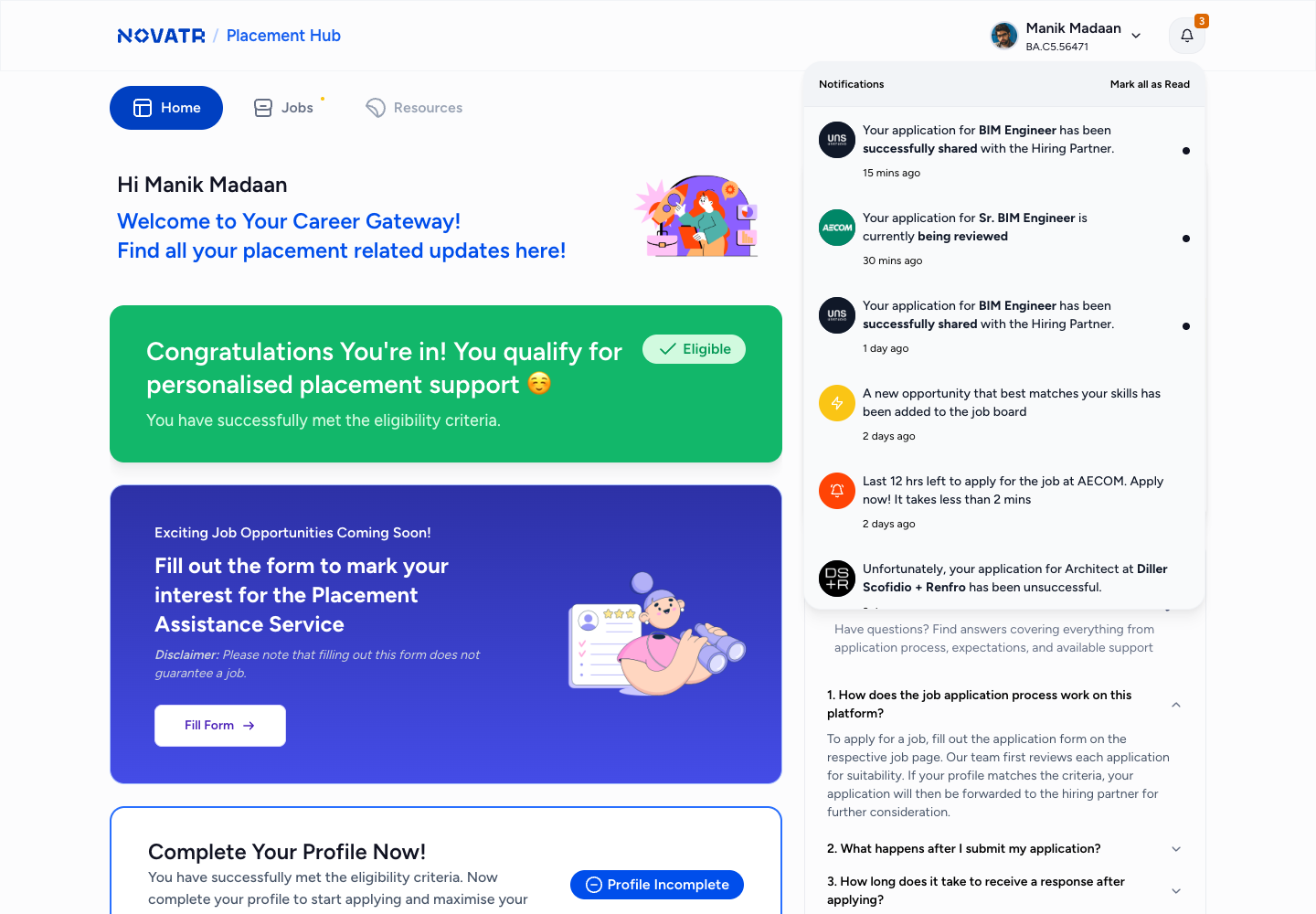
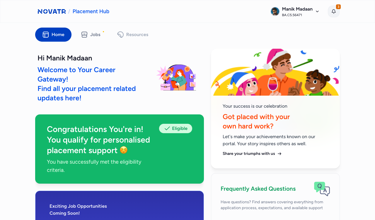
1. The course-page banner. The portal has no front door. A learner reaches it through a single banner on their course page that resolves differently depending on where they are — check your eligibility, complete the interest form, you have graduated, counting down to unlock, unlocked, not eligible, you said you were not interested. It was the first component specified, because it is the only thing that guarantees the product meets a learner wherever they happen to be.
2. Eligibility and interest. Criteria shown in full, the learner’s current shortfall named, and a route to closing it on every screen that says no. The interest form replaced the Google Form — CTC expectations, notice period, preferred location, willingness to relocate, specialisation, and explicit consent to share the profile with hiring partners, with a plain-language disclaimer that completing it does not guarantee a job.
3. Relevant opportunities. Openings grouped by relevance with counts, so a learner can see how much of the board is genuinely for them. Location is a soft criterion: a job outside a stated preference is not hidden and not blocked — the learner is told and decides. With 14 recorded cases of learners accepting offers and then declining over location, hiding those roles would have been the easy answer and the wrong one.
4. Tracking, and an ending. Reasons travel with an application at every stage — a profile not shared says why, a rejection carries the reason given. And the journey has a designed conclusion whichever way it goes.
Three endings
Placed. Accept, confirm, celebrate, then rate the experience and share the story. After that the product deliberately restricts access to the rest of itself, because a placed learner does not need job listings.
Self-placed. “Share your job news with us” — company, designation, location. Small, and aimed at the 30% of outcomes that were previously invisible to the company and unacknowledged for the learner.
Not placed. When the window closes without a placement, the learner is not logged out or quietly expired. They get a page that says the search is closing, acknowledges the difficulty, tells them their effort mattered, and asks what could have been better.
One rule inside that ending is worth stating on its own, because it was the humane decision of the project and it exists only as a note on the handover board: a learner cannot lose portal access while they are mid-process. The closing window was never absolute.
The system underneath
The visible experience was supported by a defined state model. The most complex screen resolved multiple independent conditions — relevance, eligibility, and application status — so engineering received rules and combinations, not isolated screenshots.
The state model in full
What a learner should see resolved from six inputs:
- Journey stage — where they are in the course, from learn mode to graduation
- Eligibility — not yet assessed, eligible, or not eligible
- Profile completeness — resume and portfolio uploaded, or not
- Placement standing — the learner’s overall position, including placed, self-placed, declined and disqualified
- Per-application status — from applied through to placed, with every exit reason defined
- Opening availability and relevance — whether openings exist, and whether any are relevant to this learner
Each was specified as a definition rather than a screen behaviour, so the same vocabulary could carry into the operations tool and, later, a partner-facing product.
One structural consequence is worth naming. The job description screen ended up carrying two unrelated jobs — evaluating an opening a learner has not applied to, and tracking an application already in flight. It shipped and it worked, but splitting those into two surfaces is the first change I would make now.
06Handover
The handover served two audiences: the engineers building it then, and whoever built the next product on top of it.
63 screen states, each annotated with the condition that produces it. Around 45 components with developer notes. 5 journey boards mapping flow to screen from learn mode through to graduation, 6 state boards covering every surface, and a full parallel mobile set with its own component library — all built on Novatr’s existing LMS design system rather than a new one.
The part that mattered beyond this release was the vocabulary. The status ladder, relevance criteria and eligibility model were handed over as system definitions rather than as screen behaviour, so the operations tool and any future partner product could adopt them rather than invent competing versions.
0
annotated screen states
~0
components with developer notes
0
journey boards
0
state boards
What was in the handover
- 63 annotated screen states
- ~45 components with developer notes
- 5 journey boards, flow mapped to screen
- 6 state boards — home, jobs, applications, job descriptions, pop-ups, updates
- Full parallel mobile set and component library
- Extended from the existing LMS design system
07Launch and measurement
The portal went live to graduating cohorts, and satisfaction at the placement stage was measured continuously afterwards on the same instruments that produced the baselines — so the before and after are directly comparable.
| Measure | Baseline | After* | Intended influence |
|---|---|---|---|
| Placement-stage CSAT | 0.0 | 0.0 | Clear visibility of status, eligibility, and next steps |
| NPS, placed graduates | 0 | 0 | Better closure, confidence, and celebration |
| NPS, non-placed graduates | −0 | −0 | Acknowledged, informative ending instead of silence |
| Opening to profile shared | 60+ hours | 14.5 working hours | Structured records and clearer operations workflow |
| Application rate for relevant openings | 0% | 0% | Relevance grouping, clearer deadlines, and status visibility |
| Back-outs during hiring | 0.0% | 0.0% | Better expectation-setting and visible consequences |
| Shortlisting rate for shared profiles | 0% | 0% | Better readiness and relevance checks |
| Eligible learners among those interested | 0% | 0% | Actionable eligibility criteria and preparation prompts |
One claim this case study does not make: that the portal increased the number of jobs available.
The portal made opportunity supply visible and made gaps measurable; expanding the supply of relevant roles remained an operational and partnerships responsibility.
What I would change
- Split job evaluation from in-progress application tracking. Two surfaces, two jobs, far fewer conditions on each.
- Reconcile the progressive disqualification and immediate invalid-decline rules. One consequence model, stated up front, so a learner always knows which rules apply to them.
- Create a rubric for human decisions that affect learner access to a paid service. Judgements this consequential should not rest on one person’s read with no criteria or precedent.
- Explain why a job is not considered relevant, not merely that it is not. Reasons travel with an application once it is in flight; they should travel before it too.
- Remove empty or unsupported navigation states. We shipped a section that never had content in it.
- Put primary interviews with non-placed graduates at the start of the project. That group responded to surveys at half the rate of current learners, so the people we most needed to hear from were the least represented in the data we used.
Reflection
The most important outcome was not a portal alone. It was a shared language for a placement process that had previously existed as disconnected human actions. That foundation made the learner experience clearer immediately, while making future operations, partner, and personalisation products easier to build responsibly.
Placement Hub · Novatr
Design leadership: Manik Madaan · Product design: Sanya · Product management: Swati