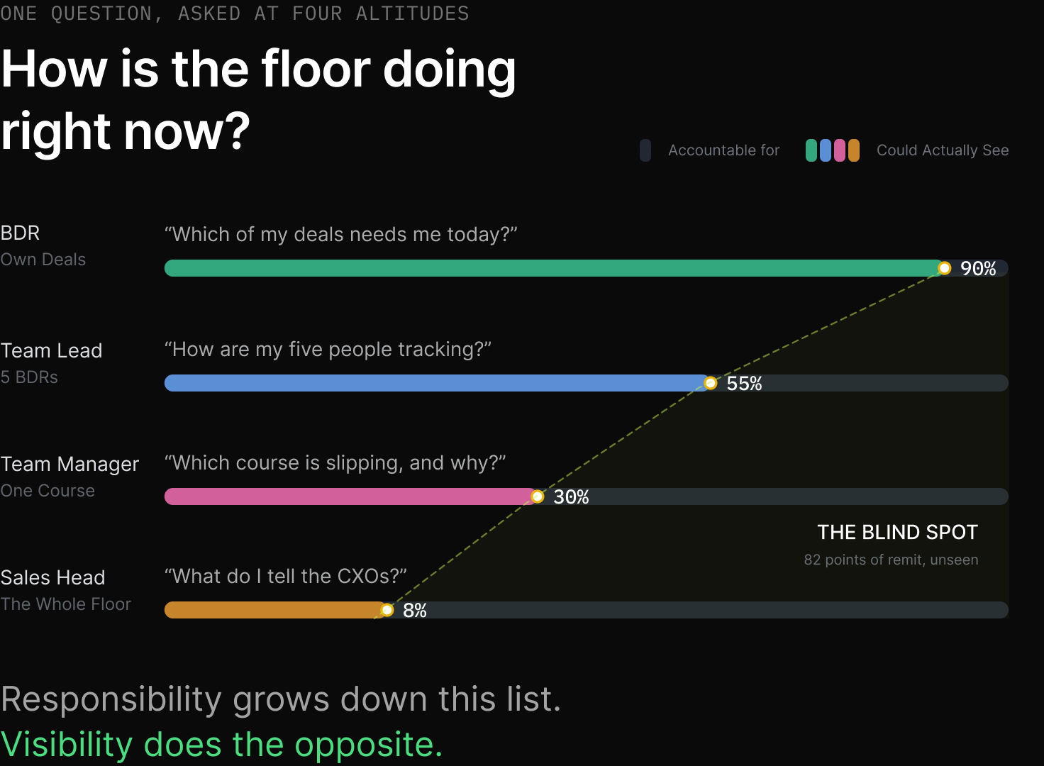
The floor had five tiers: BDR, Associate Team Lead, Team Lead, Team Manager, and the Sales Head who saw everything. The obvious brief was five dashboards, and that brief would have killed us.
What we built instead was one set of components, reused at every altitude, with only the data scope changing behind them. In v2.0 that meant one funnel-card component: four cards reading Applications Sent, Offers Shared, Converted, Payment Clearance. In the v3.0 rebuild that same principle produced a richer headline: a single flow diagram, one shape from Application through Offer, Payment and Completed, with the drop-off between every stage stamped directly on it. The four-card grid didn't disappear, it got demoted: it's now the scoped breakdown you see for one Team Manager's cohort or one BDR's own funnel, nested under the same headline shape everyone else sees.
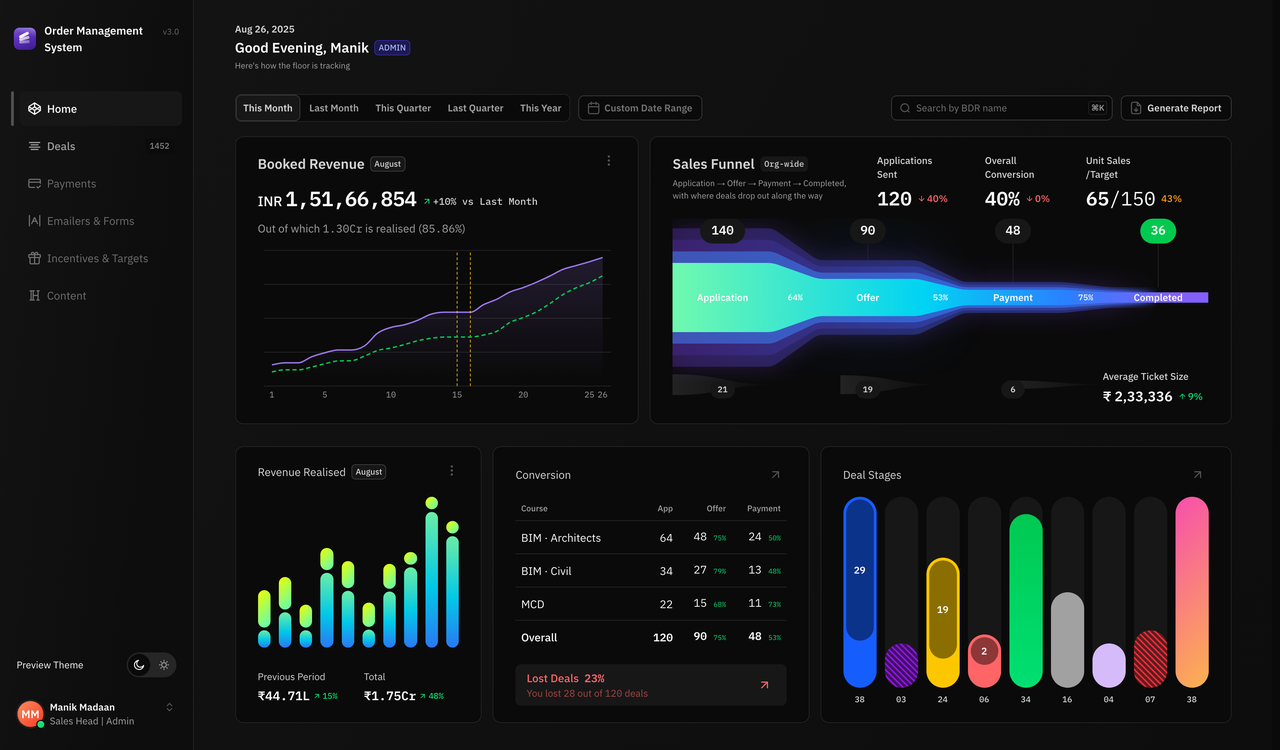
The whole pipeline, as one shape. Applications, Offers, Payment and Completed, with the conversion between each stage read directly off the ribbon. Average Ticket Size sits in the corner of the same card. This is the answer to "how is the floor doing right now", and it doesn't need a second screen.
The brief from the Sales Head, restated in his own words months after launch, was that he wanted to look at this page once and know the health of the floor, where the pipeline actually was, where deals were stuck, and what payment was coming in.
Three more cards answer the parts the flow diagram can't.
Where deals are stuck, named per stage. Nine stages, each a bar sized by count. The two hatched bars are loss buckets, Payment Plan Pending and Rejected, so a stall reads differently from a stage that's simply early. This is the direct answer to "where are deals stuck", and it's a card, not a report someone has to run.
Payment incoming, and where it's leaking. Realised revenue splits into Previous Period and Total, so a Sales Head can see how much of today's cash is old commitments finally landing versus new ones. Beside it, conversion by course with a Lost Deals count folded into the same card, because "how is the floor doing" and "where are we losing people" are one question, not two.
Booked and Realised, drawn as a gap. Booked and Realised plotted as two lines across the month, rather than a single number — the space between them is the thing a Sales Head is actually watching. There's also a payment-mode breakdown by gateway, built as its own component, that isn't wired into any page yet. No screen has been designed for it. It exists ahead of its own UI slot, which is a more honest state for unfinished work to be in than pretending it isn't there.
Team performance, named per manager
Below the floor-wide numbers, every Team Manager gets a card that answers the same questions about their own team: a heatmap of every deal's health, colour by colour, gray when the card is collapsed and lit up the moment you expand it; a pending-actions count split by Applications, Offers and Payment; a unit sales attainment figure against target; and Booked, Realised and Average Ticket Size for that manager alone, each with its own change badge.
One manager, one card, four questions answered. The heatmap alone is one deal per square, colour-coded by the same status model as the drill-down below, so a Team Manager sees the shape of their book before reading a single number.
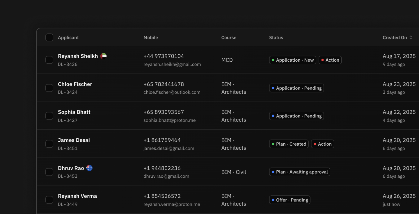
The Applications and Payments lists work the same way: same columns, same filters, different scope. Every altitude also carries the same Overview and Performance toggle. Overview shows the funnel breakdown, Performance swaps in four KPI tiles including Average Ticket Size. One toggle, learned once, meaning the same thing everywhere.
The drill-down is the piece I'd demo live. Clicking a Team Manager filters the Team Leads column to their reports. Clicking a Team Lead filters the BDRs column. Selecting a BDR populates a detail panel with that person's own funnel view, which is the same component again. A Sales Head goes from an org-wide revenue dip to the one person responsible in three clicks, without leaving the page or exporting anything.
Live, not a screenshot — click a Team Manager to see the Team Leads column filter, the way it would for a real Sales Head. The empty states carry the instruction, so the interaction teaches itself rather than needing a tooltip.
What I got wrong
The Associate Team Lead is a genuine, distinct permission tier, and it has no home in the reporting model. The admin drill-down runs Team Manager, Team Lead, BDR, straight past it.
So we shipped a role that could hold a deal but couldn't be reported on. That's an information architecture inconsistency, the IA was mine, and I missed it. The fix I'd take today is the smaller one: stop treating ATL as a tier and make it a flag on a BDR. One fewer level is worth more than fidelity to the org chart.